Babo Logo Development
Original logo
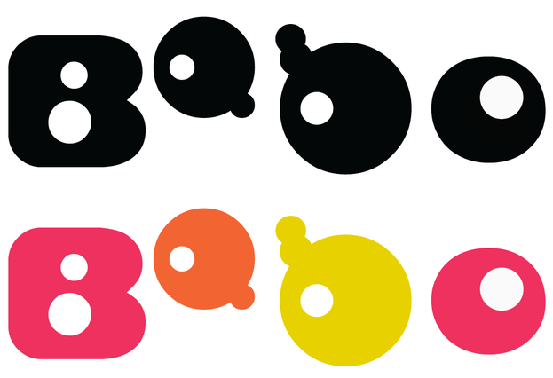
Type face: Bambina & Master Panda with editing
Black and white version and colour version
Type face: Bambina & Master Panda with editing
Black and white version and colour version
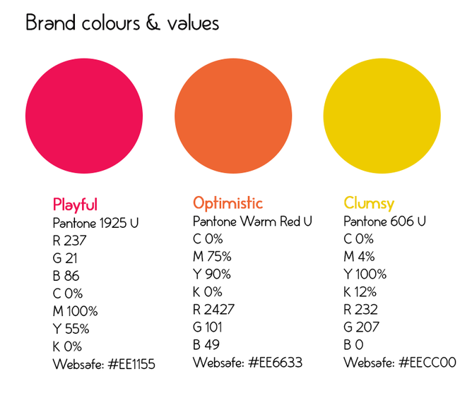
Brand colours and values
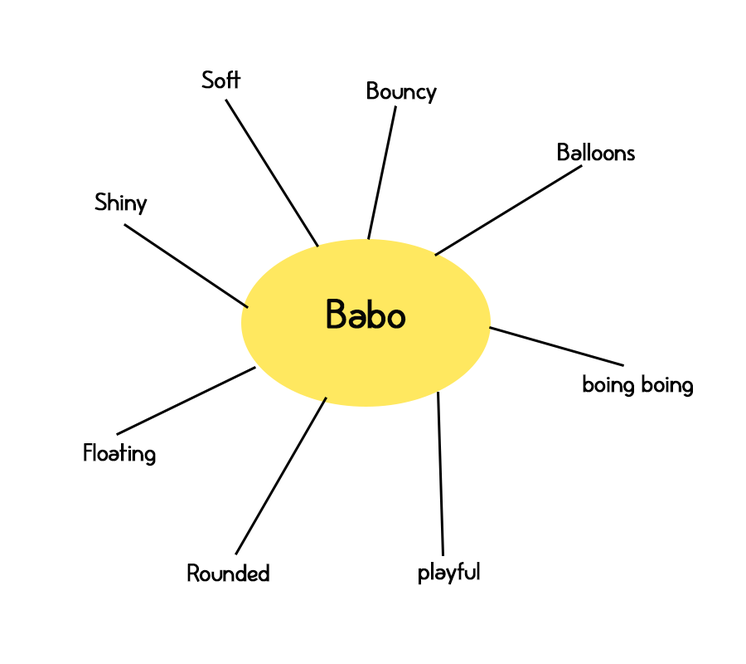
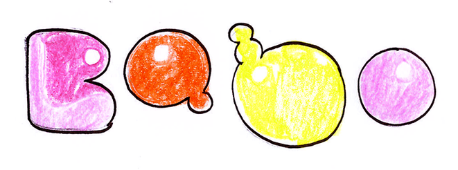
I was happy with my logo yet I wanted to improve it. Drawing a mind map of what words reminded me of Babo helped as I wanted to incorporate it into the new logo.
First Improvement
For the first development I wanted to make the logo appear soft and 'cushy'. I didn't really like the end result so decided to refer back to the mindmap and develop it further.
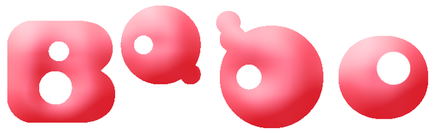
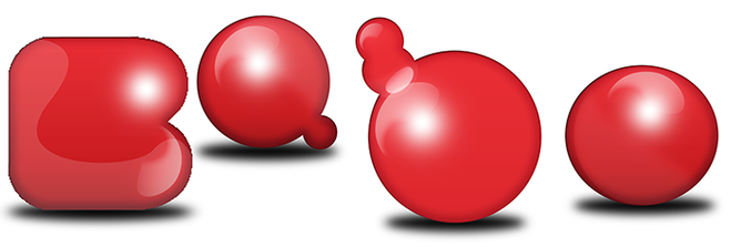
Logo- random colour
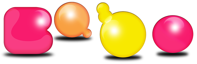
Logo- Pantone 1925 U
Logo using brand colours
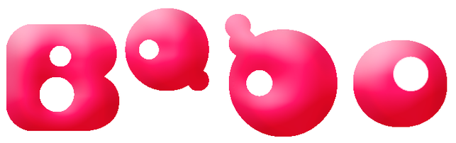
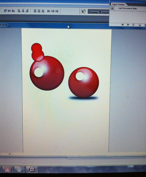
The playful and clumsy kerning of the original logo reminded me of balloons, consequently I decided to make Babo appear 3D like balloons with a shine. Looking at various tutorials online I experimented with a few and eventually created the outcome I wanted in a random colour, then added the overlay of my brand colour to complete the look.
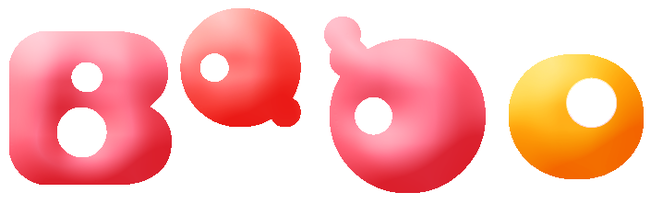
The shadows underneath the logo makes the letters seem heavy and weighed down, not like the playful, carefree and light weight balloon feel initially I wanted it to emit, therefore I will remove it to see how it looks.
Final Babo logo
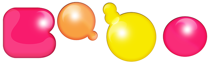
After removing the shadows, the logo immediately appears to be light, bouncy and fun which was what I had intended. The kerning I had kept the same just to keep the original style. I am satisfied with the final result and will proceed to working on the brand book.
